Range Filter
Dashboard Designer provides users with the ability to create detailed reports, allowing you to generate Pivot-type charts that offer a deep and dynamic view of your data. This enables you to analyze and visualize trends intuitively.
Steps to Create a Range Filter:
- Open Dashboard Designer.
- Create a new report or open an existing one.
- Click on the "Range Filter" icon.
- Drag and drop the columns from the main view to the "Columns" section of DATA ITEMS.
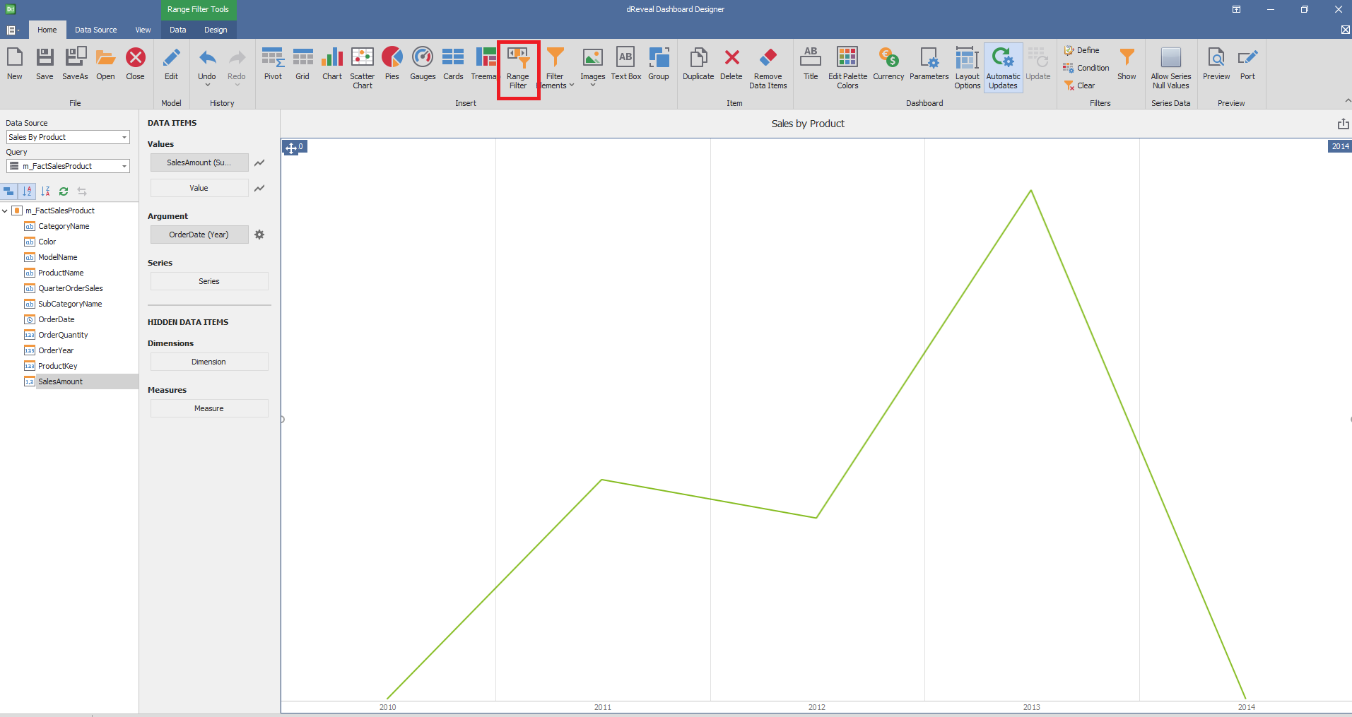
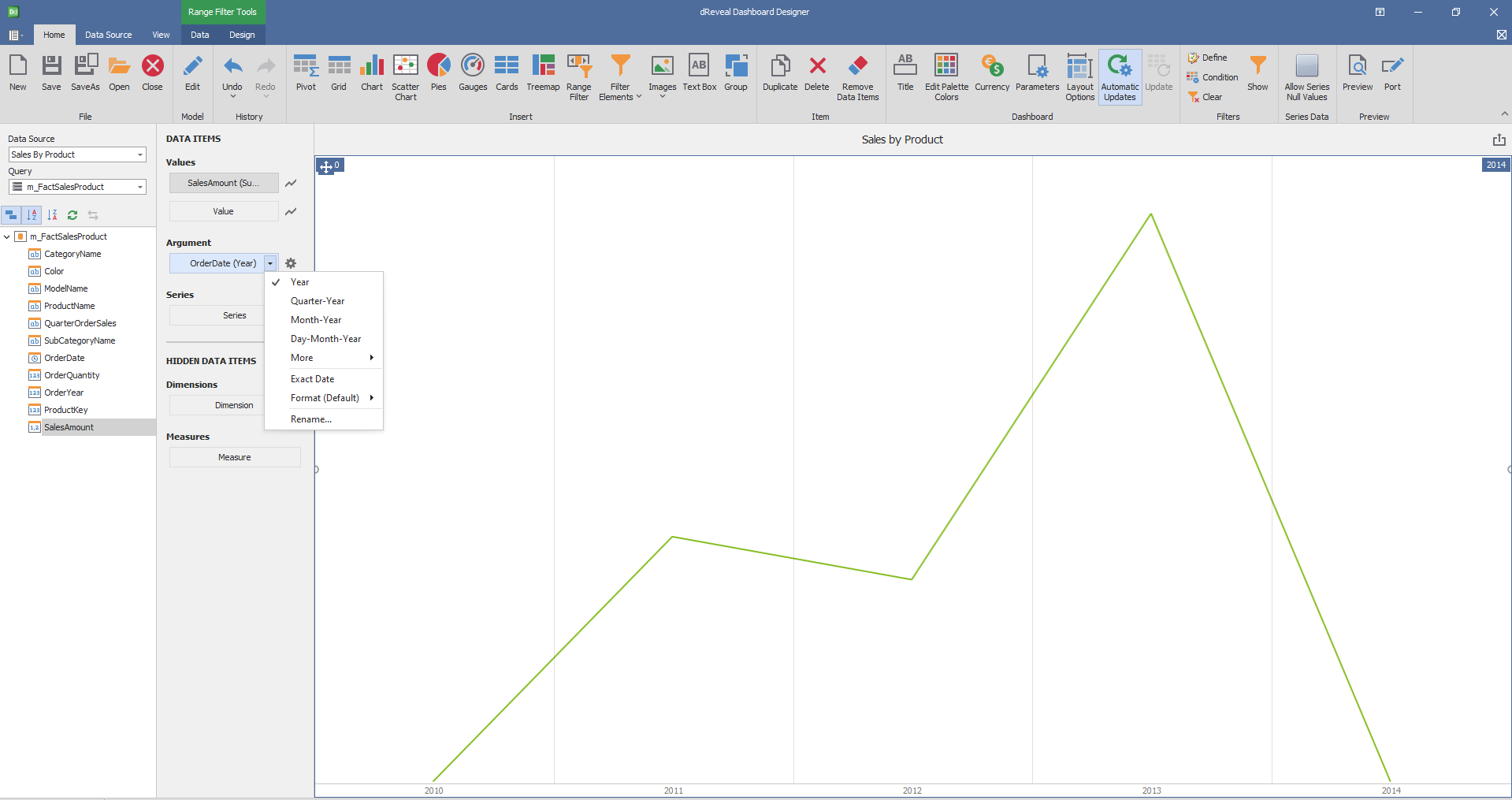
Dashboard Designer also provides various options to customize the 'Range Filter' based on the data type displayed in each column. Below is a general overview of the different options you can apply to your Range Filter Chart.
Column of type String
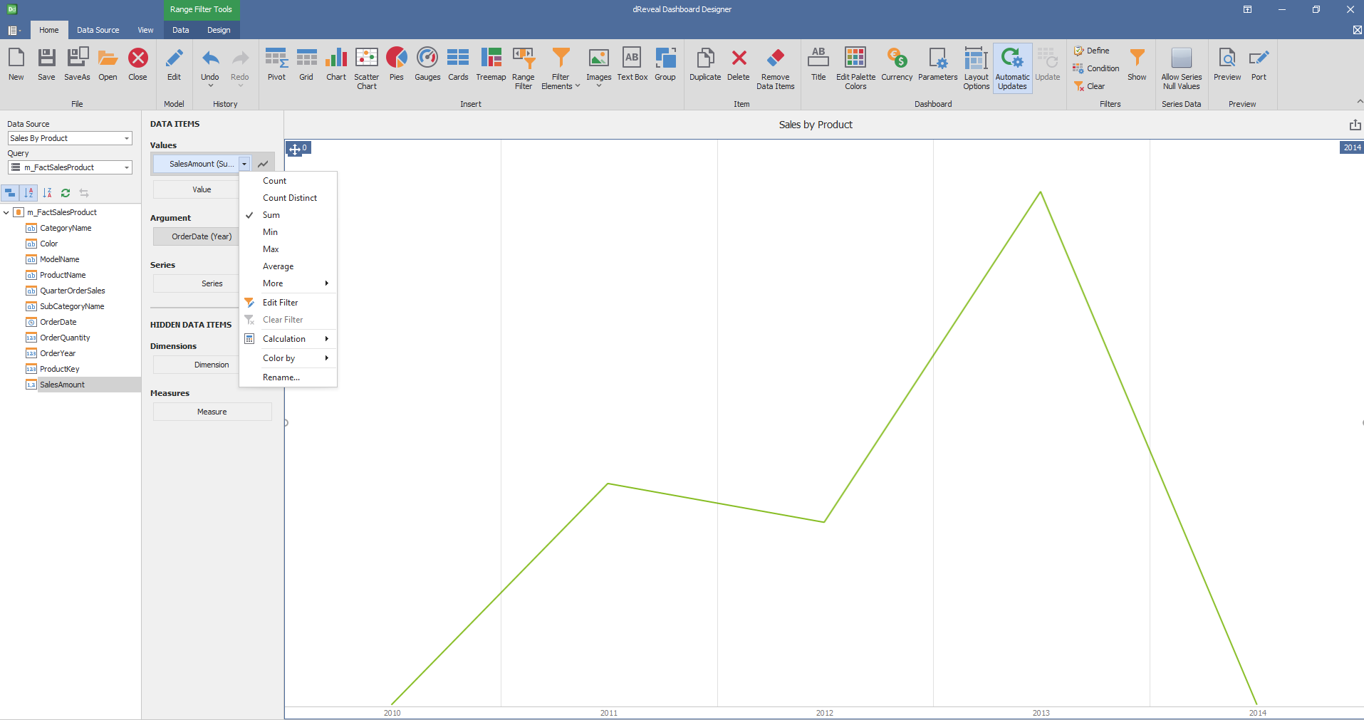
Column of type Date:
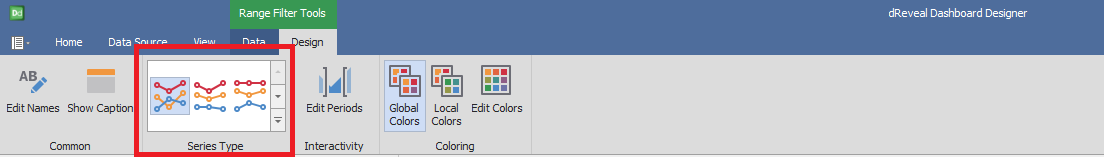
Design
Dashboard Designer also provides various options to customize the 'Ranger Filter' based on the data type displayed in each column. Below is a general overview of the different options you can apply to your Graph.
Series Type
| Options | Description |
|---|---|
| Point Line | The number of columns and rows is defined automatically. |
| Area | Arrange the elements in the specified number of columns. |
| Bar | Arrange the elements in the specified number of rows. |
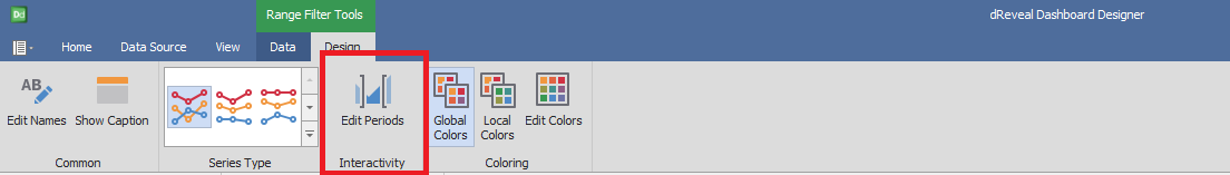
Interactivity
| Options | Description |
|---|---|
| Edit Periods | Edit date-time periods used to select a predefined range using the range filter. |
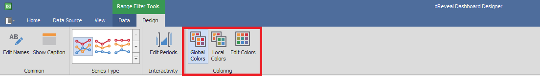
Coloring
| Options | Description |
|---|---|
| Show Gauge Captions | Specify wich values should be displayed within data labels |